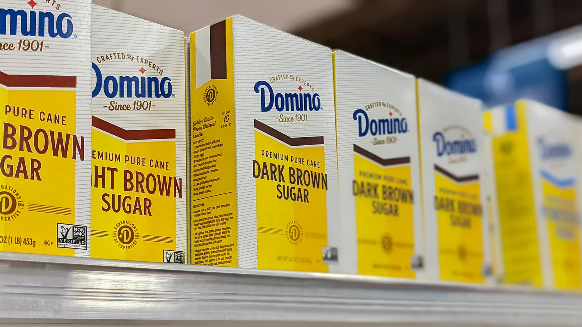
DOMINO SUGAR
Sweetening a National Icon with a Rich History
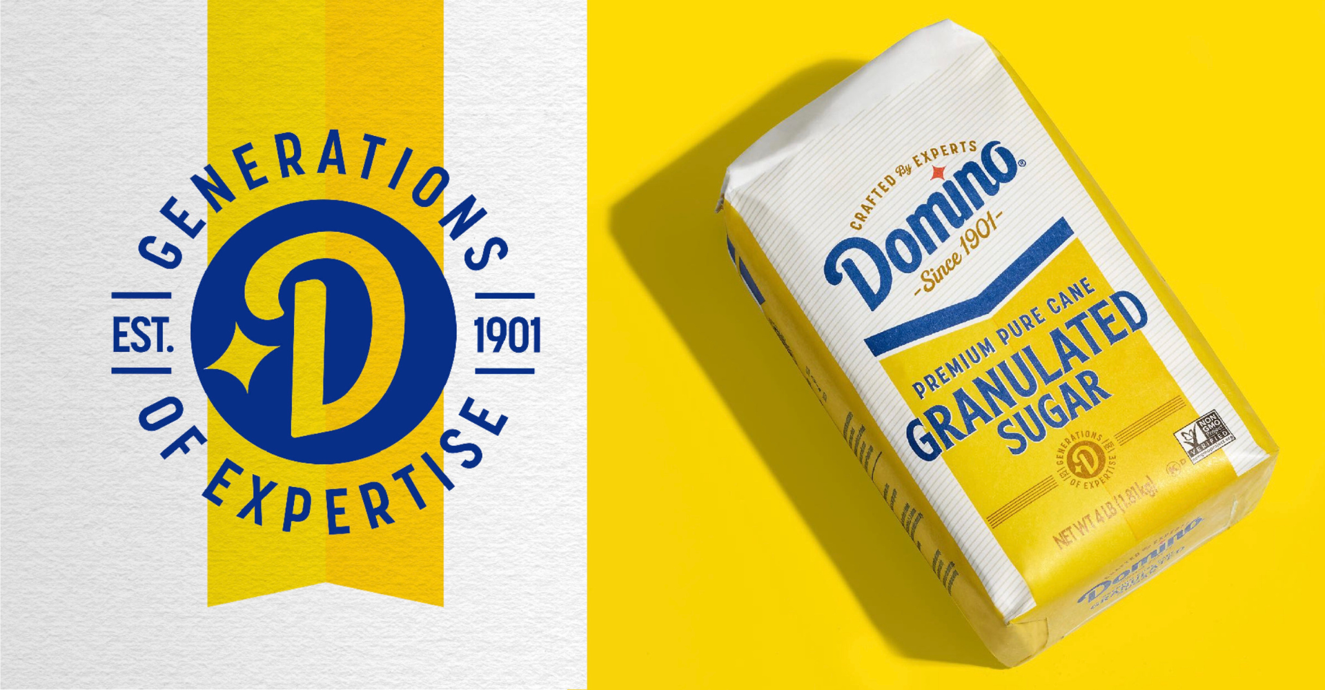
History and heritage play a large role for many long-lasting brands, and when we were asked to refresh the brand packaging for Domino’s Sugar, they made it clear that we needed to maintain the visual equity they’d carefully built over the years.
OUR APPROACH
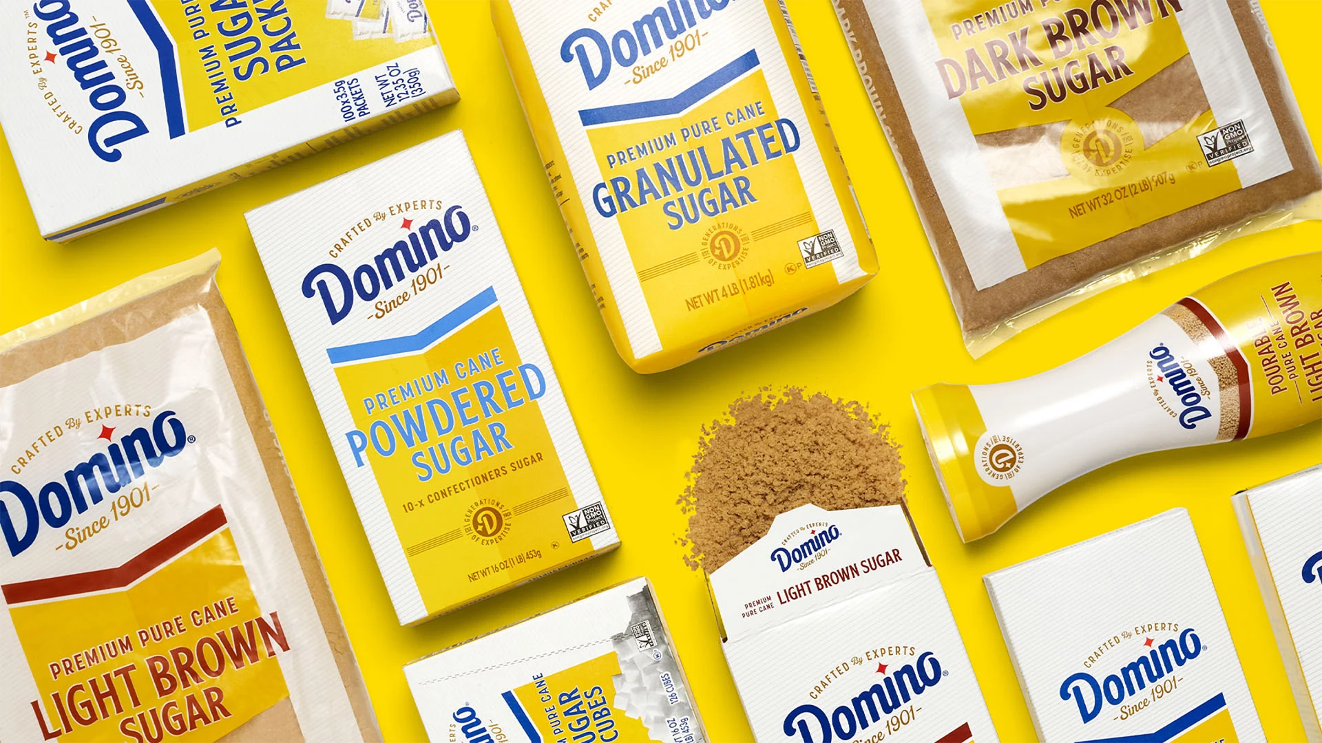
To prepare for Domino’s brand update, we studied the visual and emotional persona of the brand since its founding in 1901. From there, we navigated today’s retail landscape and category trends to find a way of bringing in an appropriately contemporary flair.
THE IMPACT
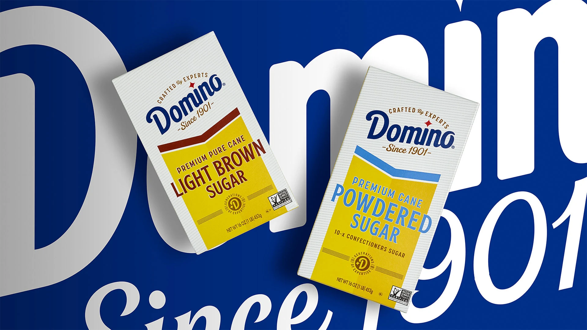
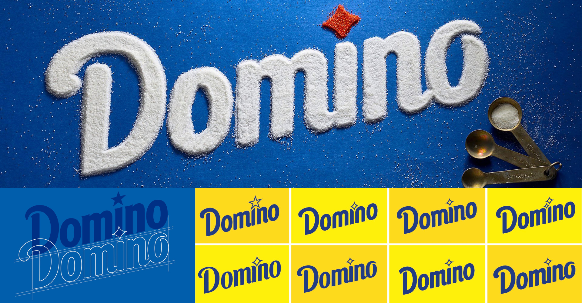
While retaining key elements like the angled logo, brand colors, crystal star graphic, and overall brand footprint, we were still able to fully revitalize the design to signal excellence and premiumization, crafted by today’s industrty experts.
