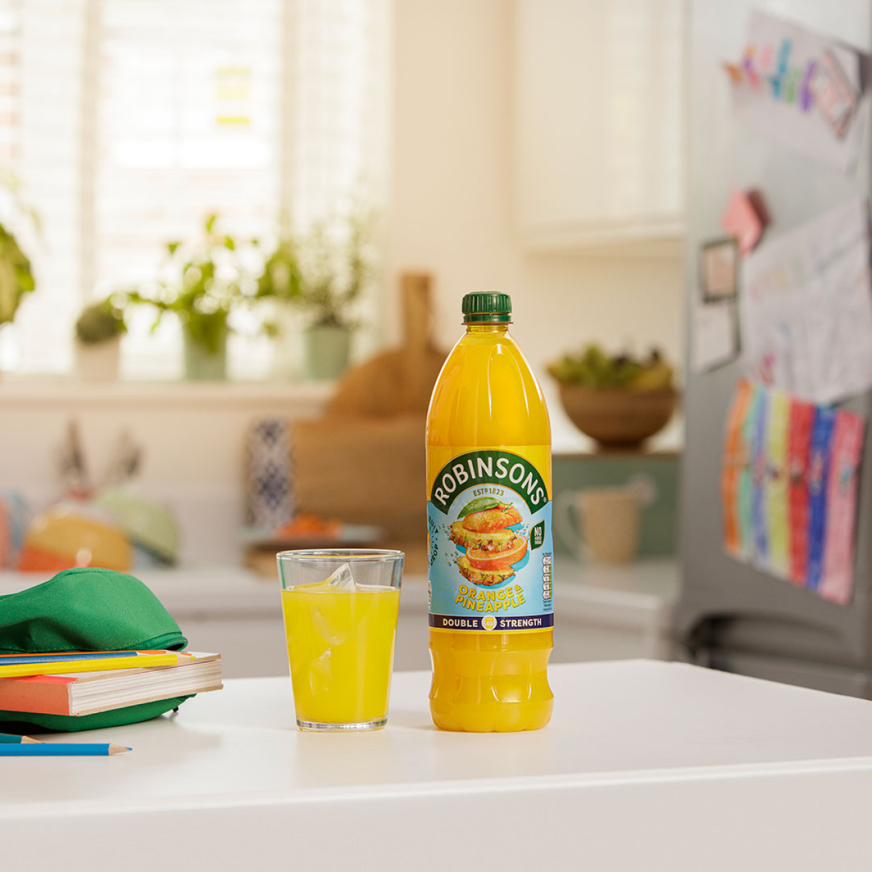
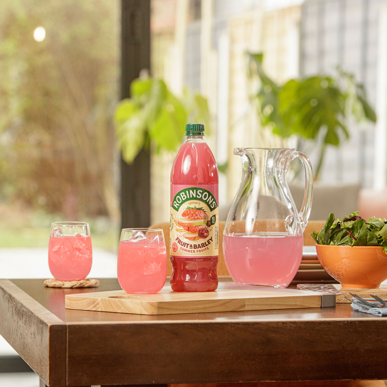
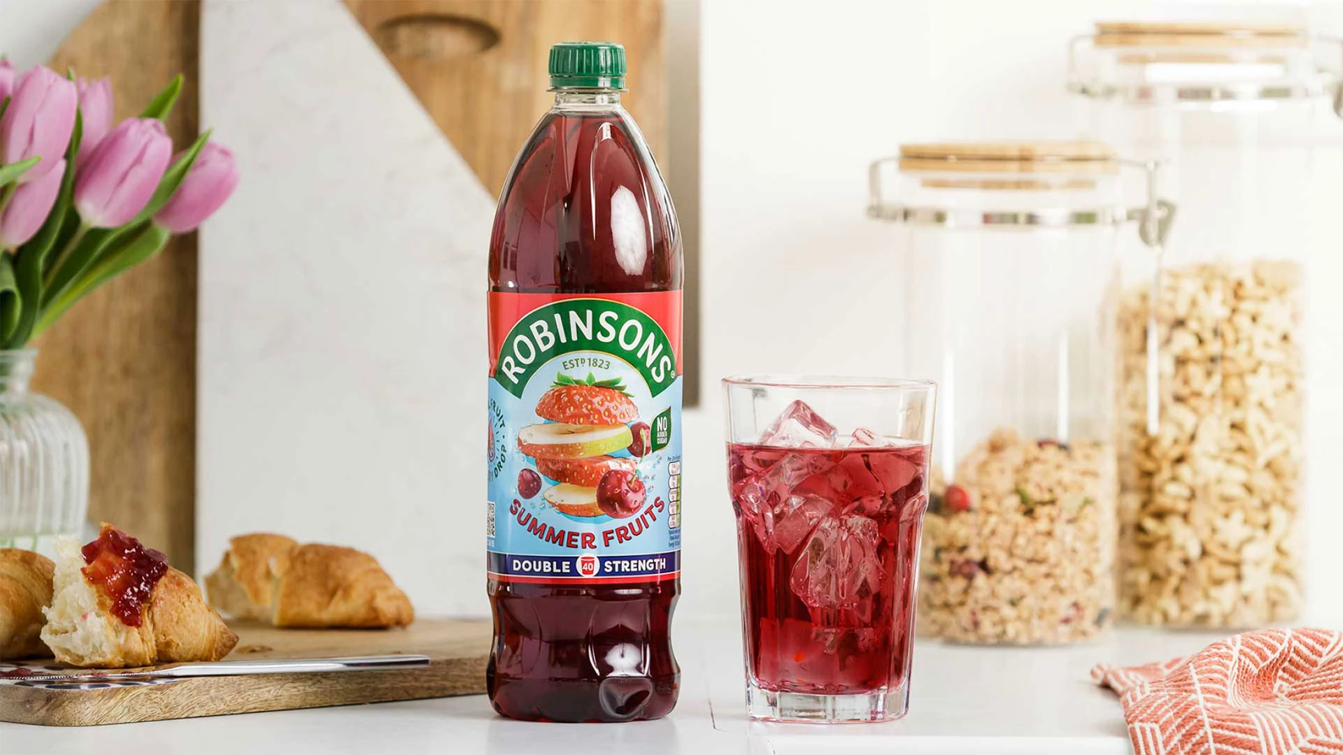
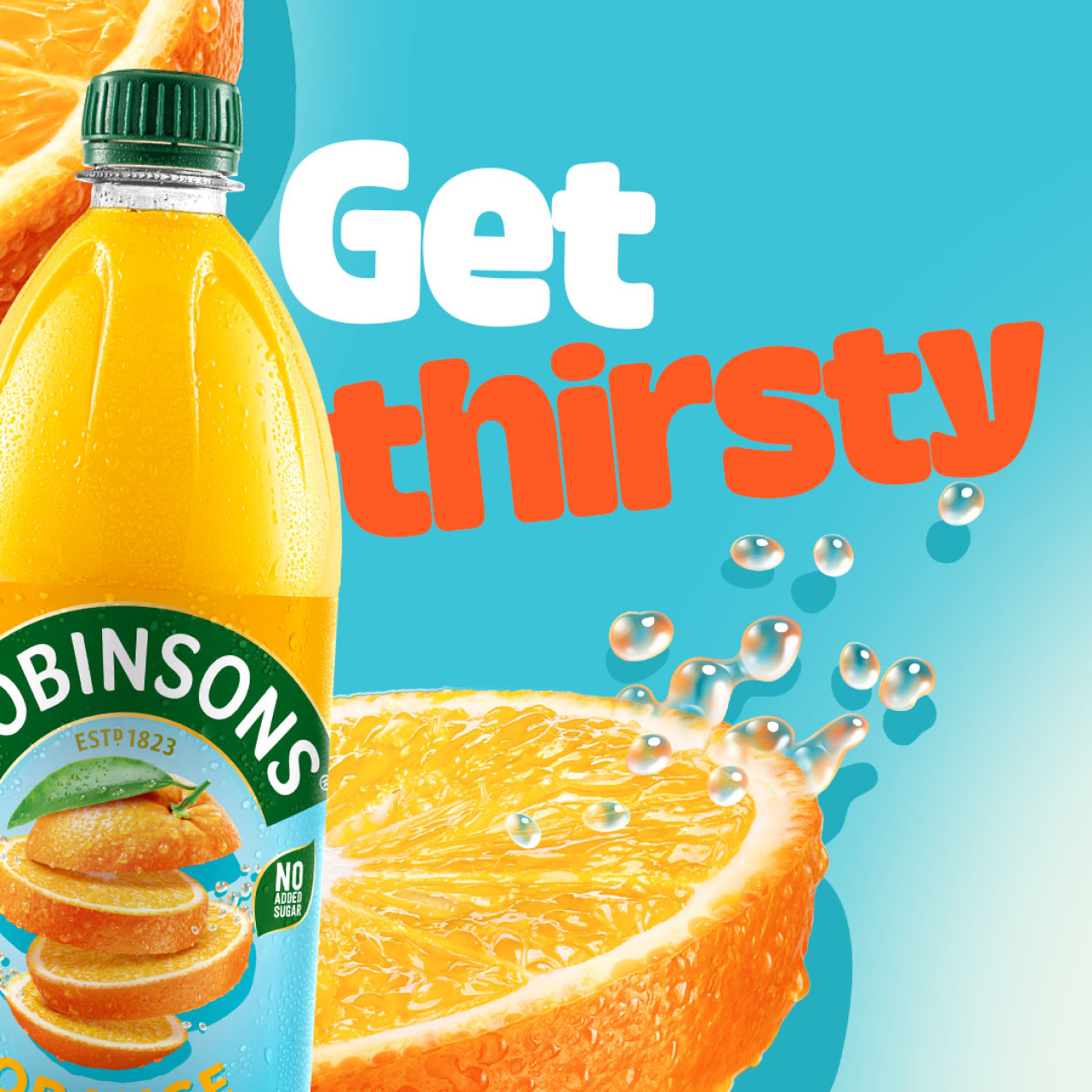
ROBINSONS
Bottles That Pack a Fruity Punch
When the time had come to radically change Robinsons’ flavor concentrate bottle packaging, we were challenged to help champion the real fruit joy in every bottle, with a redesign that resonated with modern families and reinvented current branding.
OUR APPROACH
SGK spent several days trying out colour palette and print format options to land upon the most innovative and eye-catching solution. We tweaked, tested, and made changes in real time, as a collaborative group.
THE IMPACT
After an 18-month process from start to finish, the new labels cut a striking figure on shelf, and as a team we’re immensely proud of both the result and the creative process we collectively engineered to live up to the vibrant challenge.