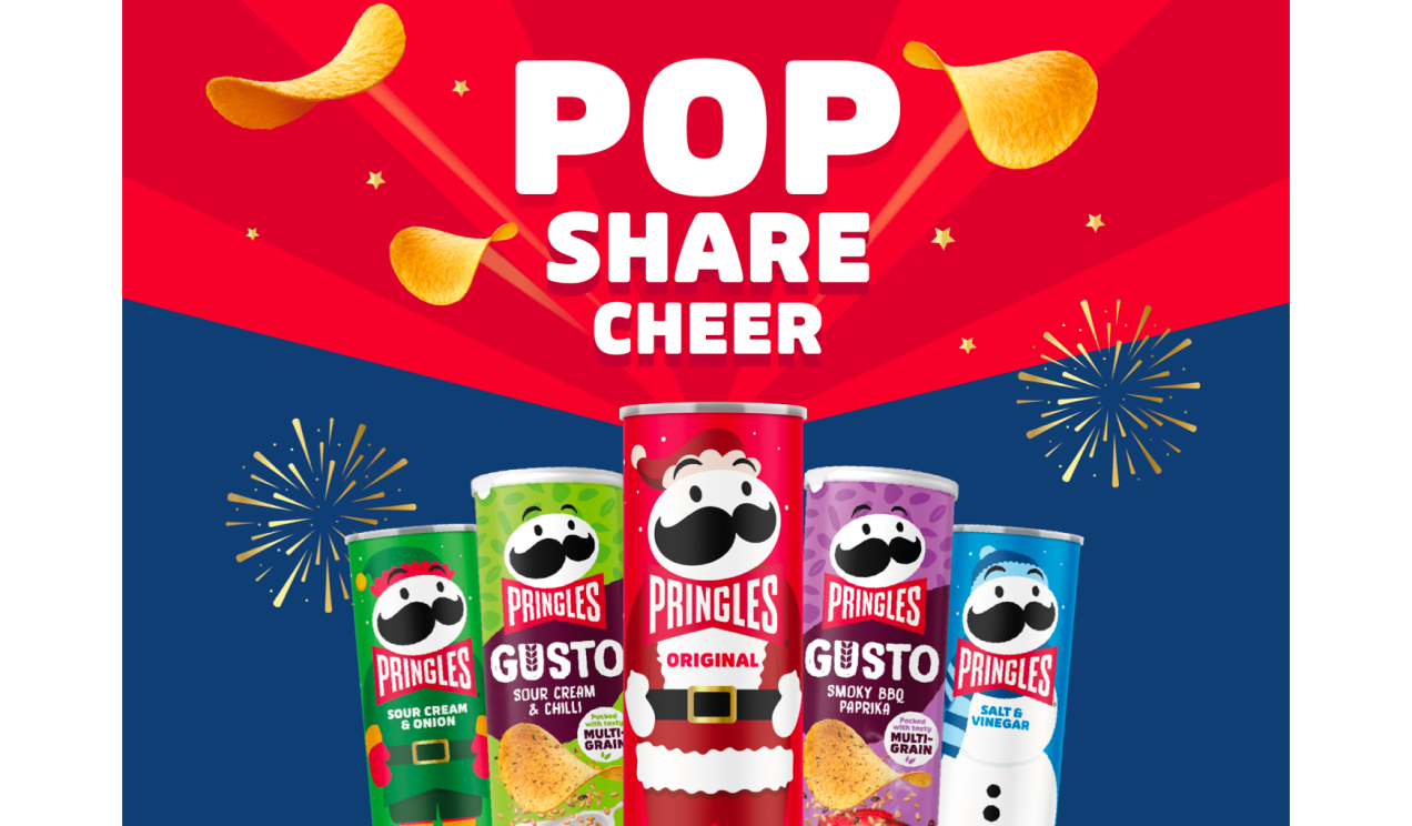
PRINGLES
Making Pringles Really Pop
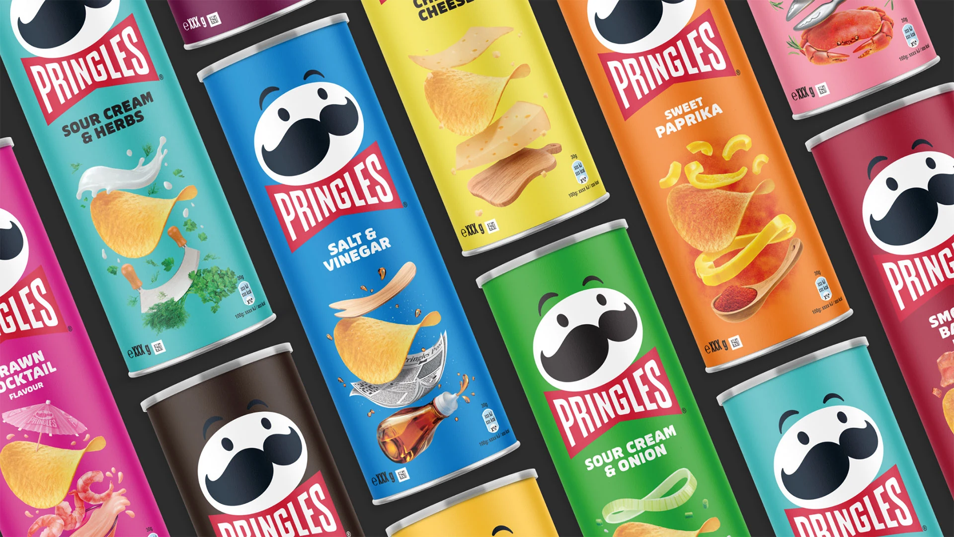
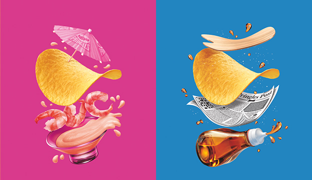
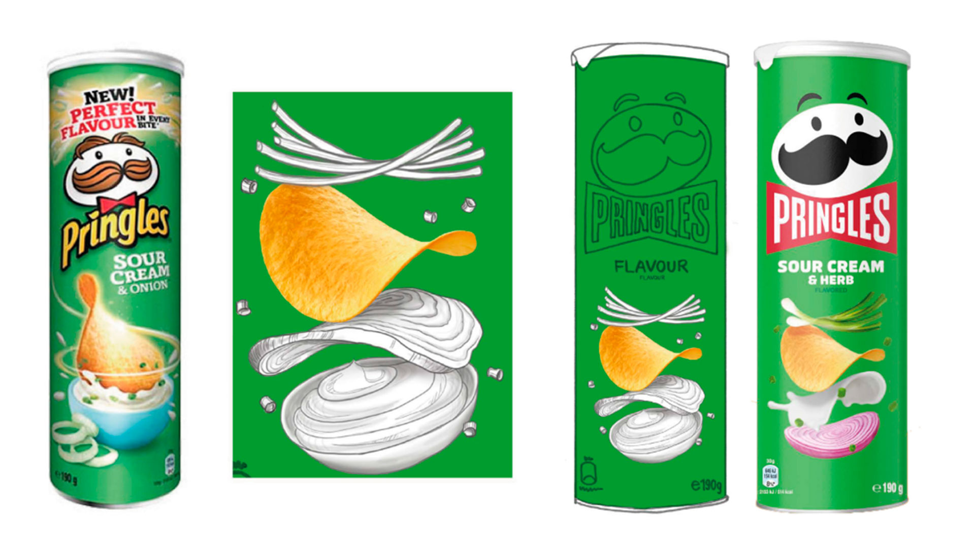
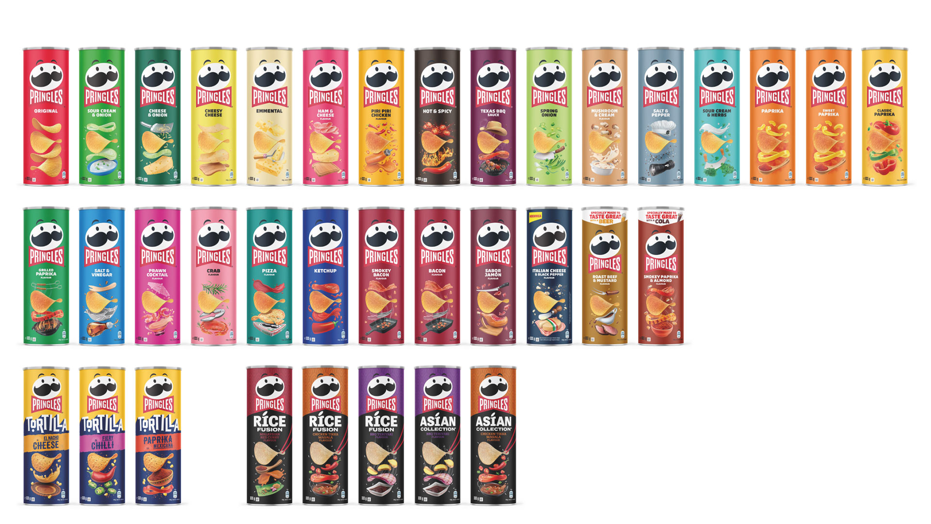
When Pringles was looking to refresh their brand and packaging identity, they came to us for help delivering the new look across a slew of unique SKUs in a variety of worldwide markets.
OUR APPROACH
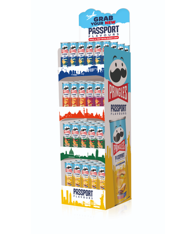
To meet the complex requirements of this global project, our EMEA, US, LATAM, and APAC teams worked closely together to develop a cohesive, personality-driven approach rooted in Pringles’ distinct design principles and visual language.
THE IMPACT
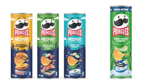
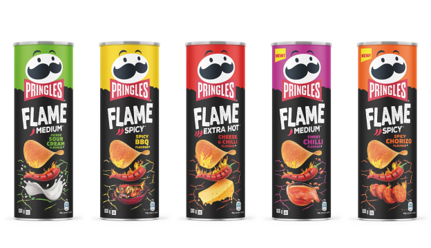
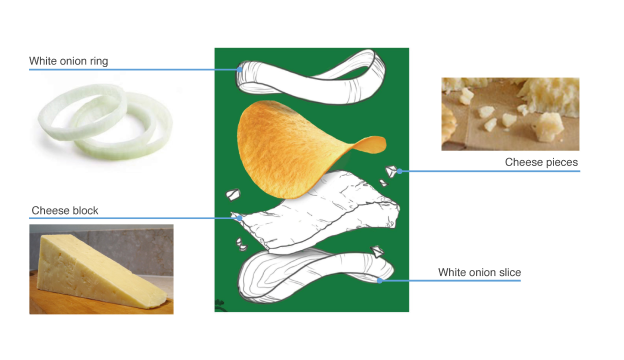
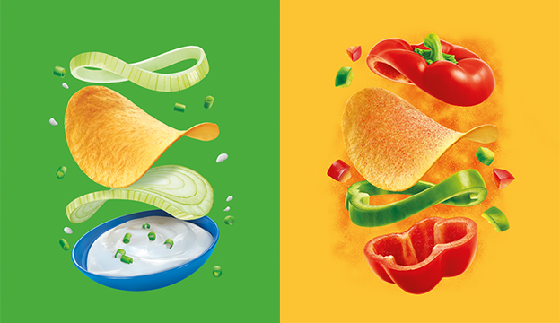
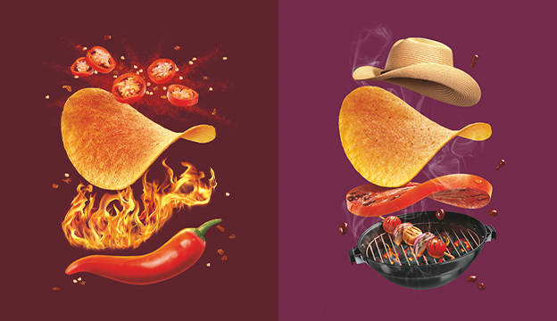
Once we popped, we didn’t stop. With this cross-studio work flow, we were able to literally work around the clock to deliver incredible, impactful packaging for more than 100 unique flavors on a global scale across five continents.
PERFORMANCE
0
Global SGK Teams
0+
Unique Flavors
0%
Uplift in U.S. Sales